
Assignment: Children’s Book Design — Mulligan Goes to Mars
Author Lonnie Whitaker asked me to help bring his latest children’s book, Mulligan Goes to Mars, to life. Before I joined the project, Lonnie had already commissioned illustrator Kristina Young, who also illustrated his three previous Mulligan titles. This was the fourth adventure featuring Mulligan the cat. I downloaded the completed illustrations via Dropbox and prepared to dive in.
Getting Started
To kick off the design process, I organized separate folders for the illustrations, manuscript, and a rough black-and-white mockup that Lonnie provided. Right away, I had questions—particularly about the title page and the cover. Kristina hadn’t created a dedicated cover illustration, and Lonnie hadn’t given any direction for it.
Judging a Book by Its Cover
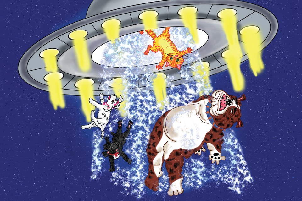
The cover is everything—especially in children’s books, where readers (and their grown-ups) make a split-second decision based on what they see. I chose the most dynamic image: a beam of light from an alien spaceship lifting Mulligan and friends into the ship. It was bold, colorful, and full of curiosity. After a quick mock-up, I shared it with Lonnie, who approved it immediately.
The illustration was great—but not quite complete. The spaceship’s edges were cropped, and some background elements distracted from the composition. Lonnie contacted Kristina and asked her to extend the left and right sides of the ship, remove the background clutter, and send the Photoshop file with layers so I could finesse it for the cover. Since the book was being printed as a hardcover, I also factored in a 0.75-inch bleed on all sides.
Staying Consistent
To keep the series branding intact, I matched the title font from the previous books using the “What the Font” app. The font? Rondouillard.
Back Cover Strategy
Lonnie provided a black-and-white sketch and a short book description for the back cover, but the copy didn’t quite capture the magic. I encouraged him to rework it with this in mind: Why would someone want to buy this book? What emotional connection can we make with the reader? Lonnie nailed the rewrite and added a strong call to action. It fit the space beautifully.
I also suggested adding the covers of the first three Mulligan books to the back cover for cross-promotion. Lonnie’s response? “You’re just full of nifty ideas. Love the idea of promoting the other books on the back!”
Clever Reuse
Children’s books don’t always require a brand-new illustration for every page. To save on costs, I often reuse or repurpose existing artwork. For the title page, which didn’t have a designated illustration, I assembled a new scene using elements from four existing pieces. The result was a fun, teaser-style layout that hinted at the story to come.
Collaboration is Key
Designing a children’s book is truly a team effort—author, illustrator, and designer each bringing something unique to the table. I value being part of the creative process and offering suggestions that enhance the final product.
Final Thought
Whether it’s choosing the right font, reimagining a cover, or repurposing illustrations, every detail matters in children’s book design. Mulligan Goes to Mars is now launch-ready—thanks to thoughtful collaboration and a shared commitment to creating a book kids (and parents) will love.