
Case study: The color purple
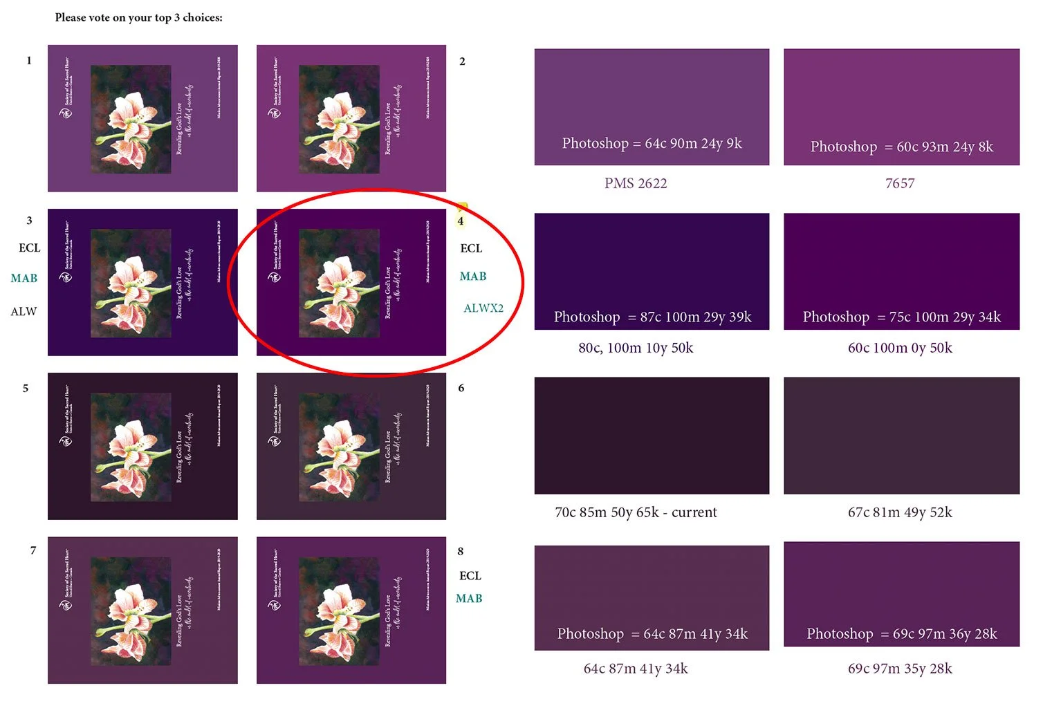
Testing eight purple options helped the Society of the Sacred Heart select the perfect CMYK color for their annual report cover.
Why You Should Never Trust Your Screen: A Print Color Proofing Case Study
Choosing the right color for a printed piece is not as simple as selecting a swatch on your computer screen. In this annual report cover case study, a watercolor amaryllis painting inspired the design — but finding the perfect dark purple background required careful color testing, CMYK swatches, and a printer’s proof.
The annual report cover for the Society of the Sacred Heart began with an amaryllis watercolor painting by Sister Donna Dolan.
“We are struck by her amaryllis surrounded in darkness. Image-wise and symbolically, it just feels right for the cover. Donna is working on getting us a high-resolution image, but this is what we’d like to use as the only image on the cover,” said my client, Eliza.
What color is dark purple?
The painting was horizontal, so we could not use it as a full bleed image. The artwork would be placed on a solid color background. Eliza wanted a dark “eggplant purple,” but that’s not an exact color. I sampled color swatches from the painting, added those swatches to my InDesign file, and showed several layouts via email, each with a different dark purple.
One purple swatch in particular looked good on screen, and we requested a color proof from the printer. The result was too dark!
Next step
Try another color test and get a new printer’s proof: I created a page of eight purple swatches, approx. 4”x2”, labeled with ink mixes, including the one that was too dark. We also added eight mini-size covers, matching the purple swatches, and sent a high-resolution PDF to the printer.
Success!
Eliza was delighted with the proof. “What a great idea! How did you know to do this?”
“I’ve been there before,” I explained. Don’t trust your screen. Make a page of color swatches with specific ink mixes and get a proof. It’s worth it!
Eliza showed the proof to her team with these instructions: Vote for your top three choices. Soon, she had an answer. “We have a winner!” With unanimous approval of the perfect purple, I proceeded to finish the cover.
The client picked #4: 60 cyan, 100 magenta, 0 yellow and 50 black.
The lesson
I learned a long time ago not to trust the colors on your screen. Make a page of color swatches and get a proof from your printer who is printing the annual report. Pick the color you like best. The proof will be extremely close as to what you'll get on press.
Color is one of the most powerful elements in design — and one of the easiest to get wrong. Whether you’re creating an annual report, a book cover, or another printed piece, professional design and careful print preparation make all the difference.
Need help bringing your project from concept to finished piece? Nehmen-Kodner provides professional design and print production guidance to help ensure your final product looks as good in print as it does on screen.