
Font Decisions by Committee
Do you struggle to choose a font?
I usually don’t.
But sometimes my clients do—especially when the decision involves a committee. Or several committees.
When Everyone Has an Opinion
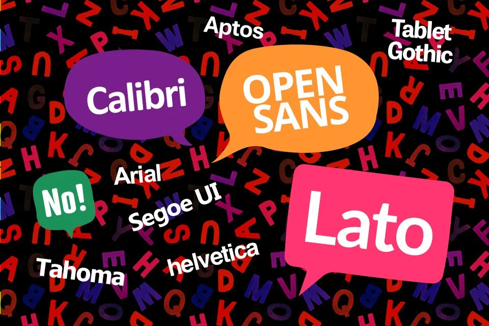
The Franciscans (OFS), a religious order, asked me to enhance their procedures manual. The document was created in Word and, at first glance, it was well organized and set in Calibri.
Their accessibility committee wanted a font that would be easy to read. Their accessibility guide recommended basic Microsoft Word fonts—Helvetica, Tahoma, or Arial—set at a minimum of 14 point. Solid, practical options.
One of their samples suggested Segoe UI.
No.
Segoe UI doesn’t have a true italic—only a slanted version pretending to be one.
Instead, I presented three readable sans-serif options with multiple weights and real italics: Aptos, Lato, and Open Sans, all set at 13 pt.
A week later, I received this message:
“We just heard from four other members of the team. After reviewing the options, they prefer Trebuchet MS at 12.5 pt. Three of us prefer Lato at 12.5 pt. If you had to choose between these two styles, which would you prefer?”
“I respectfully disagree,” I replied.
“My recommendation was Lato or Open Sans.”
To clarify the decision, I sent a sample page comparing Trebuchet and Lato, along with an explanation:
“Lato’s clarity ensures it resonates with a broad audience, making it a strong choice for conveying information with empathy and impact. It also offers more font weights if needed, while Trebuchet has only the basic styles.”
Rule by Committee
Still not satisfied, the team asked another question:
“It would help if you could create a PDF using Tablet Gothic so we can compare it side-by-side with the others.”
I did—by switching to InDesign. (I used Table Gothic on their Rule Book.)
I also reminded the committee that what they were comparing on their screens—or printing on home printers—would not perfectly reflect the final printed result.
The Search Continues
The font discussion continued.
A week later, the team suggested Arial 12.
Please… no.
I explained why. Arial is generic, overused, and lacks personality. It’s most commonly used for basic corporate correspondence by people who don’t know—or don’t use—anything better.
Then another suggestion appeared: Noto Sans.
At that point I replied:
Stop searching. Pick Lato or Open Sans.
Don’t widen the choices—narrow the focus.
The response came back quickly:
“Good advice.”
Finally… a Decision
After more than a month of discussion, the team finally agreed on Lato.
Even the committee member with significant vision challenges approved the choice.
Victory.
Know Thy Fonts
Experience with typefaces is essential for designers. Choosing the right font isn’t just about personal taste—it’s about readability, accessibility, and function.
Sometimes the process requires research.
Sometimes it requires persuasion.
And sometimes it requires patience… especially when a committee is involved.
In the end, a well-chosen typeface quietly does its job: helping readers focus on the message instead of the typography.
Test Before You Decide
Another important step in typography is testing fonts and point sizes in real conditions.
A typeface that looks fine on a computer screen may behave very differently when printed. Line spacing, letterforms, and weight can affect readability more than people realize. Even a half-point change in size can improve legibility, especially for readers with vision challenges.
That’s why professional designers create sample pages and review them both on screen and in print before making a final decision. Seeing a full page of text—not just a headline or a few lines—helps reveal how comfortably the type reads over time.
Typography isn’t just about choosing a font. It’s about testing how that font actually performs for the reader.
Why Experience Matters
When authors hire a professional book designer, they’re not just paying for layout. They’re investing in the details that make a book—or a document—clear, readable, and professional.
Because when typography is done well, readers don’t notice the font at all.
They simply enjoy the message.