
Designing Around Trademark Restrictions
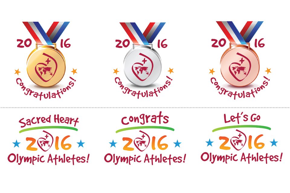
Sometimes the best design solutions come from the biggest constraints.
My client, Donna, wanted to celebrate alumni competing in the 2016 Summer Olympics. The original concept was clever—but it relied on imagery protected by Olympic trademarks. We needed another approach that captured the excitement without violating strict brand guidelines.
After reviewing the Olympic Brand Protection Guidelines, we realized we couldn’t use the Olympic rings or official typography because the Society of the Sacred Heart wasn’t an official sponsor. That meant going back to the drawing board.
Here’s what we did
Developed an original logo system instead of imitating the Olympic identity.
Drew inspiration from the Rio color palette without copying protected artwork.
Selected a free typeface that schools could easily download and use.
Created a family of coordinated graphics that individual schools could customize while maintaining a consistent look.
Outcome — incredible!
Donna knew there would be so much activity on social media around the Olympics so she distributed the logo package and usage guidelines to schools throughout the Sacred Heart network.
As Donna explained:
“One added advantage of these marks is that, as we use them together, it make the Sacred Heart voice that much stronger. The consistent use of the core elements of the marks will reinforce how unified the Sacred Heart family truly is.”
By making the marks available in a variety of formats but with a consistent look and feel, all those cheering on the Olympians were able to be creative and yet consistent in their communications digitally and through social media.
The logo marks are a huge success—connecting the SOSH family worldwide! Donna received enthusiastic feedback from schools across the globe.
“The level of engagement has been incredible, coming together, working together and cheering on our Olympians together has fostered such a deep connectivity for the Society and its schools all over the world. Having some images that would work for everyone was the springboard to this result.”
How exciting to get great feedback and see these logo marks used online. I am honored to have been a part of this project’s success.
Good design isn’t just about making something look beautiful. It’s about understanding the client’s goals, respecting trademark and brand guidelines, and finding a creative solution that works.
Sometimes the best creative solution isn’t the first idea—it’s the one that respects the rules while still accomplishing the client’s goals.
Need a logo or visual identity that stands out while respecting brand and trademark requirements? Explore our logo portfolio and see how thoughtful design can solve even the toughest creative challenges.