
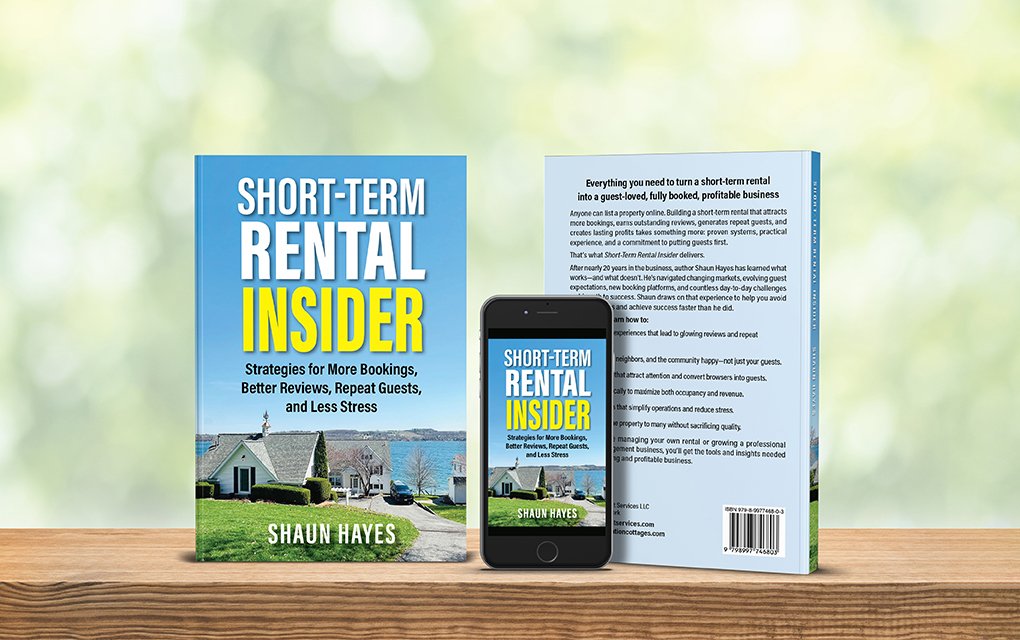
Shaun Hayes is a first-time author whose book project came to me through a referral through his editor, Sandra Beckwith.
Designing a book cover for Shaun was easier than settling on the title. Here’s the working title he originally proposed: The Short-Term Rental Playbook: An Experienced Property Manager’s Guide to More Bookings, Better Reviews, Repeat Guests, and Less Stress.
Research: Looking Beyond the Cover
Part of my book design process involves research. I look at what’s selling and gather information from top-selling books in the same genre. That’s when I discovered another book on Amazon with the exact same title, and it was a bestseller.
Although book titles can’t be copyrighted, using an identical title can confuse readers. Title development is generally the author’s responsibility, but in this case, I saw an opportunity to suggest alternatives. The original title was lengthy, and I wanted to explore options that would be more distinctive and work better visually on the book cover.
This is one reason I research the competition before beginning a book cover. I’m not just looking at colors, photographs, and typography. I’m also looking at titles, subtitles, and how other books are positioned in the marketplace. A little research at this stage can help an author avoid confusion and make more informed decisions.
Title Development: Finding a Distinctive Identity
Coming up with a book title isn’t always easy, even for experienced authors. I had the opportunity to ask author Zibby Owens about the title of her book Between Chapters. “Was it easy to come up with the title?” I asked. Her answer was no! There were many iterations before she finally landed on Between Chapters.
It was a good reminder that finding the right title takes time. In Shaun’s case, I wasn’t trying to take over that decision. I simply saw an opportunity to explore a title that would work well both for the book and its cover.
I suggested three possibilities that retained the important keyword phrase “Short-Term Rental” while creating a more distinctive title. Several competing books also used that phrase in their titles. I did a quick Amazon search to check that my new suggestions weren’t already being used.
Shaun selected: Short-Term Rental Success: An Experienced Property Manager’s Playbook for More Bookings, Better Reviews, Repeat Guests, and Less Stress
It was clear and searchable. However, I couldn’t stop thinking about the title. The words “Success” and “Playbook” had appeared several times in this genre.
A few days later, another idea came to mind. I shared it with Shaun, and he agreed:
“Insider” suggests real-world experience and knowledge. It’s also distinctive and memorable, speaking to property managers at all levels.
This was an opportunity to help Shaun think beyond the original working title. We wanted to retain the important search phrase while giving his book a more distinctive identity.
Cover Design: Standing Out in the Genre
I typically create two folders during the research stage: one for competition and another for inspiration. I’m looking for ways to create a cover that fits the genre while still standing out from the competition.
Several competing books featured beautiful property photographs. This was an excellent direction for Shaun’s book because he had wonderful photographs of his rental properties.
I selected a photo with a large area of sky, providing plenty of room for the title and subtitle. I asked Shaun for the high-resolution image. The only Photoshop adjustment needed was increasing the canvas size to accommodate the title.
Most competing covers used bold sans-serif typefaces. Several also featured blue as the primary color with yellow as an accent.
Our cover typography followed a similar approach. The title was stacked in three rows, with “Insider” larger than the other text, on it’s own line, in yellow to stand out against the blue sky. The result was a professional cover that fit the genre while giving the book its own identity.
Shaun was very pleased with the final design. He was also receptive to suggestions throughout the process, making our collaboration especially enjoyable.
Interior Design: A Consistent Look Throughout
The book was professionally edited, and the final manuscript was prepared for layout.
The book contained 18 chapters divided into four parts. I carried the bold sans-serif typography from the cover into the chapter titles and subheads to create a consistent look throughout the book.
The part-opening pages used a simple typographic treatment, giving readers a clear sense of the book’s organization without adding unnecessary decoration.
Publishing: Getting the Book Ready for Readers
Shaun planned to publish the paperback and ebook through Amazon KDP first, followed by IngramSpark for wider distribution.
I also encouraged Shaun to ask readers for reviews when the book launched. Reviews can help build visibility and give prospective readers another reason to consider the book.
More Than a Book Cover
Working with a first-time author is an opportunity to guide the book through several important design decisions. Research helps identify what’s working in the marketplace. Thoughtful title development helps a book establish its own identity. And a well-designed cover and interior bring everything together.
That’s what I enjoy about book design. It’s not just about making a book look good. It’s about helping an author present a professional, cohesive book that readers will want to pick up.
When should you contact a book designer? Ideally, before you think you need one. Let’s talk!