
Viral Vengeance book cover
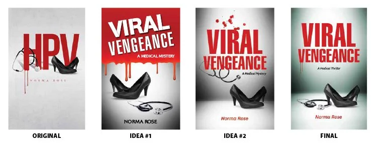
From HPV to Viral Vengeance: A redesigned cover that better communicates the book’s genre and improves discoverability.
Assignment: Design a new book cover for Viral Vengeance. The author, Norma Rose, had previously published her book under the title of HPV. I liked the first cover and asked the author why she was changing the title and cover art. She explained that HPV did not sound like a thriller and was hard to find via search engines. My goal wasn't simply to create a better looking cover. I wanted the redesign to clearly communicate that this was a medical thriller while preserving the visual strengths of the original.
Why the Cover Needed a Redesign
Creative challenge: Design a cover similar to the first book but indicated that this was a medical thriller. So, I purchased Norma’s book and started reading. The female protagonist is a young military doctor named Mariah Gordon. Dr. Gordon is a talented and successful obstetrician/gynecologist. Her patients are victims of an outbreak of cervical cancer, caused by a super strain of HPV. She confronts a medical mystery that will test her skills, her spirit, and her relationship.
Execution: Key design elements are women’s black heels, a stethoscope, blood dripping from the title, and a condensed, bold, sanserif type face (in all caps). The new title was longer, especially the word “Vengeance.” The protagonist wears black heels to work. Fortunately, I found the exact shoe photo that was used on the previous cover. This was an economical stock image to purchase. The stethoscope was already in my digital library from another project.
Norma wanted a black background, but I convinced her that black shoes on a black background would be too hard to see. I presented two designs: one layout had a large field of “blood” with the title reversed out of red. Norma didn’t like that version. Version 2: a gray background with a soft horizon line looked similar to her previous book and added perspective to the cover. This layout showed blood dots above the title so it would not interfere with the stethoscope wrapping around the title text. Norma preferred this layout, but without the drips.
Balancing Design and Marketing
Final tweaks: Because the direction was to add long blood drips on the title lettering, I needed to use another stethoscope photo. This second image “lies on the floor.” (it was used in the rejected layout) The stethoscope’s flexible tubing is wrapped around the shoe heel, the composition is balanced and looks natural. I was pleased with the results.
The author and I agreed to add “A Medical Thriller” under the title so the target audience quickly recognized the genre. One last author request: make the background a green tint like a military hospital. This was not my preference, but Norma was happy with the results.
Conclusion: Norma provided the final page count so I could determine the spine width and finish the back cover. To complete the project, I uploaded a high-resolution PDF to CreateSpace (now KDP), and I gave the author both high- and low-resolution cover JPGs to use for marketing.
Does your book cover match your book’s audience?
A professionally designed cover does more than look attractive—it tells readers what kind of story they’re about to enjoy. If you’re publishing a book or wondering whether your current cover is sending the right message, I’d be happy to help. Schedule a free consultation, and let’s create a cover that works as hard as you do.