
Small Catalog, Big Results: Designing for a Hispanic Audience
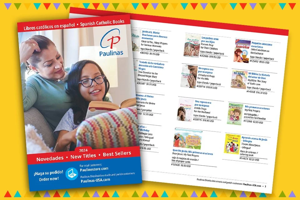
Bilingual text and a clean layout made it easy for conference attendees to browse Spanish Catholic titles.
Originally published March 2024. Updated August 2026.
Sometimes the smallest projects produce the biggest results.
I had the opportunity to design an eight-page bilingual catalog for a group of dedicated Sisters who manage bookstores and publish materials for a religious order. The goal was to connect with Spanish-speaking readers at a regional conference.
Meeting the Challenge
The Sisters recognized the growing demand for Spanish-language resources and wanted a promotional piece they could distribute at an upcoming conference. Their original idea was a simple pamphlet or flyer, but as we discussed the project, the format changed to a small, easy-to-carry catalog featuring their most popular Spanish Catholic books.
There was only one catch—the conference was just around the corner.
“Are you available to work on this right away?” they asked.
I said yes.
A Well-Organized Team
One reason the project moved so smoothly was because the Sisters came prepared. They supplied the book cover images, carefully edited bilingual text, and even a hand-drawn sketch showing how they envisioned the catalog. Having those materials ready allowed me to spend less time gathering information and more time focusing on the design.
Creating a Clear, Bilingual Layout
The Sisters shared a catalog they admired, which gave me a helpful starting point. From there, I developed a clean, organized layout that was easy to browse.
Each spread paired a book cover with bilingual descriptions, making it simple for readers to compare titles. Following the organization's graphic standards, Spanish book titles were set in Noto Sans Condensed Bold, making them easy to distinguish from the English titles while maintaining a consistent visual style throughout the catalog.
A Cover That Welcomed Readers
The front cover needed to do more than look attractive—it needed to speak directly to the intended audience.
Working from the Sisters’ creative direction, I found a stock photograph of a Hispanic mother and daughter reading together. The image fit the catalog's purpose and the audience they hoped to reach.
A bold red banner across the top identified the catalog as Spanish Catholic Books, while a bilingual “Order Now” call to action and website information made it easy for readers to learn more and place orders. The back cover highlighted new releases and repeated the contact information for future purchases.
The Results
The catalog was a success.
After the conference, the Sisters shared wonderful feedback:
“It was an immense blessing to be able to share the catalog with Hispanics who came to our booth and willingly took it... During the conference we received requests from four new booksellers to establish an account with us. The catalog is light, beautiful, and clear. Many people were grateful for the clarity of the contact information, and several people commented on how attractive—and easy to carry—it is. You will be hearing from us again!”
Hearing that the catalog generated new bookseller accounts made the project especially rewarding. Good design isn’t just about creating something attractive—it helps people find the information they need, strengthens a client's message, and supports their goals.
Final Thoughts
This project is a reminder that successful design isn’t measured by the number of pages in a publication. Whether it’s an eight-page catalog or a 300-page book, thoughtful design and careful organization can make a meaningful difference.
This article is part of the N-K Creative Design Archive, where I share projects, publishing insights, and lessons learned from more than 30 years in graphic design and book publishing.