
Case Study: Better Safe Than Sorry?
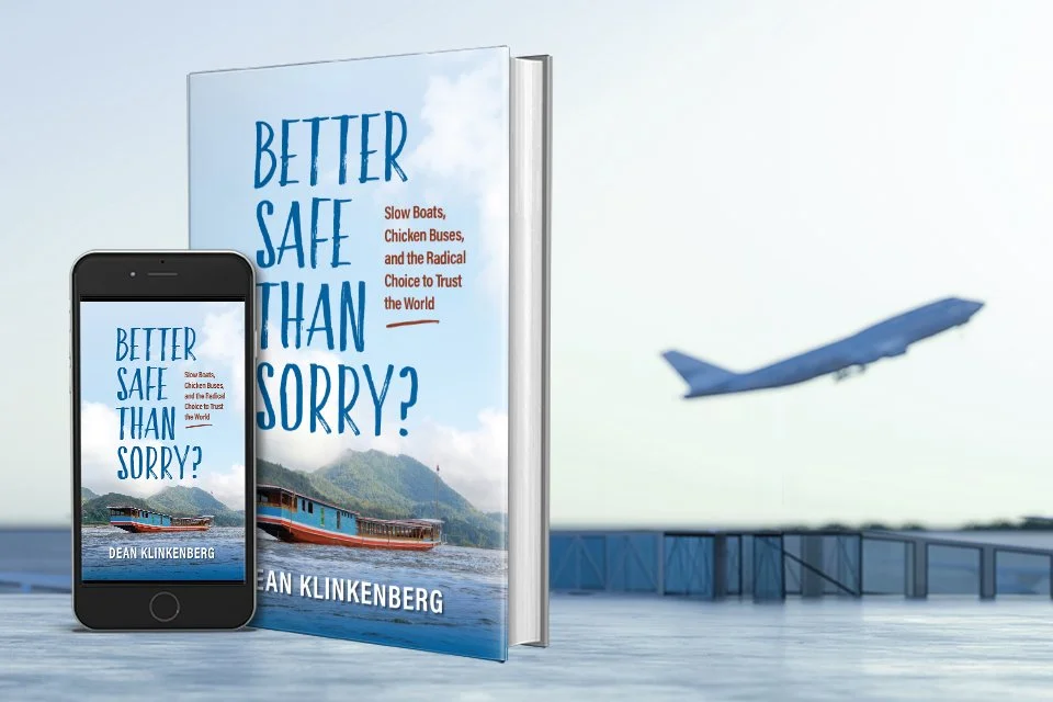
Author Dean Klinkenberg’s new book, Better Safe Than Sorry?, is a travel memoir that shares stories from journeys across the United States and around the world. The book asks a simple but powerful question: What happens when you stop asking, “What if something goes wrong?” and start asking, “What if everything goes right?”
Finding the Right Cover Concept
Dean’s initial cover idea featured a personal photograph of himself crossing a rickety bridge in another country—a scene that looked anything but safe. The image connected well with the title and the idea of taking risks while traveling.
After researching competing travel memoirs, Dean suggested replacing the photograph with an illustration since many books in the genre use illustrated covers. We explored converting the photograph into an illustration but the results never felt quite right.
Instead, I created two layouts using the bridge photo at a smaller size, combined with a world map background. This approach provided plenty of room for the title and subtitle: Slow Boats, Chicken Buses, and the Radical Choice to Trust the World.
A Change in Direction
During a Zoom meeting, Dean asked for my honest opinion about the bridge photo. I reluctantly admitted that it wasn't working for me. While the image supported the title, it didn't seem to reflect the subtitle.
I asked, “Do you have a photo of a chicken bus?”
A chicken bus would immediately catch my attention as a reader and connect directly to the subtitle. Unfortunately, Dean didn't have a cover-worthy photograph of either a chicken bus or a slow boat.
We began searching for alternatives and found a photograph of a slow boat on Wikimedia Commons that was available for public use. Slow boats, commonly found in Laos and other parts of Southeast Asia, are unfamiliar to many readers and create a sense of curiosity and adventure. The image felt more closely aligned with the subtitle and the travel experiences described in the book.
The new photograph offered plenty of open space for a large title and subtitle—an important consideration since many readers first encounter a book as a thumbnail image online.
Choosing the Typography
I tested numerous font combinations and presented Dean with two cover options.
One used Merriweather, a friendly and traditional serif typeface. The other featured Faith and Glory Two, a condensed hand-painted brush font with a rustic, dry-brush texture that conveyed a sense of adventure and personality.
Dean shared both designs with his team, and they unanimously selected the version using Faith and Glory Two.
Multiple Formats
Dean launched his book through a Kickstarter campaign with a special-edition hardcover featuring color photographs. After the campaign concluded, additional formats were released, including:
Paperback editions for KDP and IngramSpark with black-and-white photos
Ebook edition
Audiobook edition
3D book mockups for Kickstarter promotion and social media marketing
Author Feedback
“Thanks to Peggy's insights and unflinching critiques, I have a book cover I love and that really pops!”
— Dean Klinkenberg, author of Better Safe Than Sorry?
Looking Back
It was an honor to work with Dean again. We first met through the St. Louis Publishers Association and have collaborated on several projects over the years, including covers for his Frank Dodge mystery series.
As this project demonstrates, the strongest cover concept isn't always the first idea. Sometimes the best solution emerges through exploration, experimentation, and a willingness to change direction when something isn't quite working.
If you’re planning a book project and need an experienced partner to help bring it to life, contact N-K Creative to discuss your next book.