
Case study: designing the cover for What’ll We Do with All the Churches?
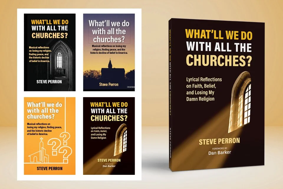
A look at how this memoir cover came together — from first conversation to final design
Every book design project starts with a conversation with the author. Steve Perron described his upcoming memoir, What’ll We Do with All the Churches?, as part memoir, part essay, and part song lyrics. The songs and commentary explore the historic decline in religious affiliation in the United States. Steve planned to sell his book at conferences and events where he'd also be performing.
Starting with questions
Before I start searching for images or ideas, I ask the author to tell me what the book is about in two or three sentences. A short description — almost like an elevator pitch — is really useful for understanding what we’re working with.
From there I ask a few more questions: What is the tone of the book? Do you have any specific ideas for the cover? Are you thinking traditional or contemporary? With that information, I can start looking for cover ideas. I also ask for the total word count (to put together an estimate) and the trim size.
Comp titles
My first step is to search for comp titles — covers of books that compete in the same market. I also ask the author to share a list of titles in their genre, so I can get a sense of what styles are out there and what's selling. I make a folder called “Inspiration” to collect ideas for layout and direction.
One image that caught my eye was a broken stained glass design I came across on Instagram. It had something interesting about it. When I looked into it, I found out it had been created with AI.
Stock images
Next, I search stock image sites and flag anything that might work. The question here was: what represents the decline of religion? The title was the obvious starting point — a church. There are a lot of church images to sort through, so I was looking for something that could be manipulated in Photoshop or Illustrator and work around a long title and subtitle.
Steve’s title and subtitle were both long, which meant the type needed to take prominence. The image had to work around it, not compete with it.
Steve found a black-and-white church window image and thought it might work. “I’ll give it a shot,” I told him.
Cover design
I shared my initial layouts with the editor / project manager. This was a challenging subject, and I ended up doing more layouts than planned — three using traditional photos and one with a more contemporary look. The editor didn’t prefer the contemporary version, and neither did the author. The final direction: a church window with sunbeams shining through.
As mentioned, the title and subtitle were long. Below the author's name was also the name of the foreword’s author. I used Acumin Pro Condensed, a sans-serif typeface, and pulled colors directly from the window to tie it all together.
Steve and the editor were very pleased with the result. Here’s what Steve had to say:
IN STEVE'S WORDS
It’s been good working with you!
You are very direct and clear with instruction, direction, and feedback.
You are honest with critiques and constructive criticism.
You went out of your way to suggest options for learning more about the writing, publishing, and marketing process.
You are always clear on where you are in the process and what your next steps are.
Thank you, Steve!
Working with Steve was a good reminder of why I love this work. He came in knowing what his book was about and that makes all the difference. Not every project is straightforward, but when the author and designer are on the same page, the work gets better.
If you’re working on a book and thinking about the cover, I’d love to hear about it. Every project starts with a conversation — and that part is always free.