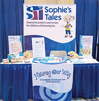
Designing a trade show display required rebranding a logo for Sophie’s Tales, an entrepreneurial start-up that offers innovative products and services for children with hearing loss. Owner, Melanie Paticoff, provided an Adobe Illustrator file. The assignment wasn’t to redesign the logo. Melanie gave me the “green light” to enhance and update her brand logo.
 Improvements
The top consideration was the company name which appeared miniscule in the old logo under the ST (Sophie’s Tales) icon. It needed punch. The design process included selecting a similar san serif type face to the one in the old logo (ITC Kabel bold), enlarging the point size to the height of the icon, and moving the name to the right side of the icon. Emphasizing the name brought more visual recognition to the Sophie’s Tales.
The old logo was mauve-purple, almost pastel, and originally used for Melanie’s two award-winning Sophie’s Tales children’s book series. Now, Sophie’s Tales had to appeal to teens; tweens; children, both girls and boys, as well as adding punch to the trade show display. When in doubt, use dark blue.
Happy Accident
While picking specific Pantone colors, I accidentally “pegged” the wrong color in the space between the S and the T. Ahhh! That looked good, so I tried some other colors, too. This visual spark gave the logo more life. The result was a multi-color icon that popped.
I was a bit nervous about showing the new logo to Melanie, because she didn’t expect to see this change. But, she loved it! The updated logo popped on the roll-up retractable banner. N-K was proud to revamp this identity and help promote a budding entrepreneur.
 Follow-up
The trade show went great and was a huge success. Congratulations to Sophie’s Tales!
To see more logo examples, click the portfolio link.


